But Woody Allen stopped being funny in the Eighties!
typed for your pleasure on 6 March 2007, at 11.45 amSdtrk: ‘La fille à la moto’ by Dani
A lot of times I doubt the validity of these online tests, but I think they pegged this’un:
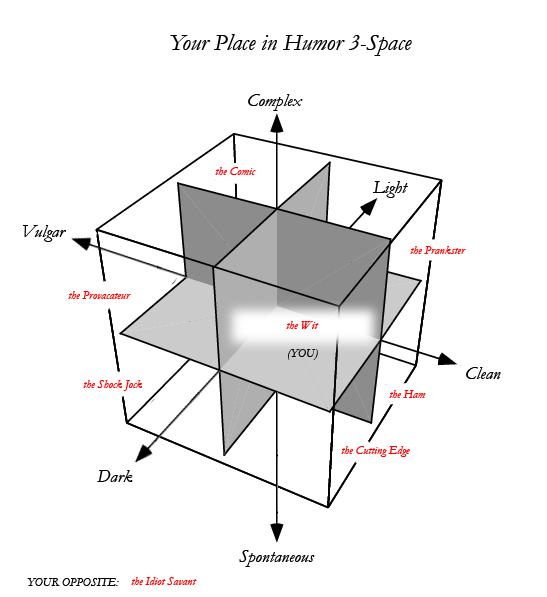
the Wit
CLEAN | COMPLEX | DARK
You like things edgy, subtle, and smart. I guess that means you’re probably an intellectual, but don’t take that to mean pretentious. You realize ‘dumb’ can be witty — after all isn’t that the Simpsons’ philosophy? — but rudeness for its own sake, ‘gross-out’ humor and most other things found in a fraternity leave you totally flat. I guess you just have a more cerebral approach than most. You have the perfect mindset for a joke writer or staff writer. Your sense of humor takes the most thought to appreciate, but it’s also the best, in my opinion. You probably loved the Office. If you don’t know what I’m talking about, check it out here: http://www.bbc.co.uk/comedy/theoffice/.
PEOPLE LIKE YOU: Jon Stewart – Woody Allen – Ricky Gervais
– it rules –
If you’re interested, try my best friend’s best test:
The Genghis Khan Genetic Fitness Masterpiece
| Link: The 3 Variable Funny Test written by jason_bateman on OkCupid Free Online Dating, home of the The Dating Persona Test |
It’s true; I do love the comic stylings of Ricky Gervais. But what thinking individual doesn’t?
I have to say though; I’ve no idea why I’d scored higher than 99% on darkness, spontaneity, and vulgarity. Wouldn’t higher than 99% of vulgarity make me the bastard lovechild of John Belushi, Adam Sandler and Andrew Dice Clay? Hideous, hideous.
Apart from that, I’d completely agree. Plus, I really like the cube graphic. It lends the test a certain gravitas.
I also have to add; I actually took this test almost a year ago, and couldn’t really post it to my old blog, as the code for the layout was a hassle to alter, that graphic was too damned big, and the text in the graphic was too fine for me to reduce the pic size to any degree of readability. Now that I’ve switched to WP, it’s not as huge and obnoxious. You can place the blame squarely on Quizilla. It’s code like that that makes Myspace pages look like fucking trainwrecks.
Well, obviously, that’s not the only thing that makes Myspace pages look like shite, but you know what I mean
Random similar posts, for more timewasting:
Le tee hee on November 30th, 2006
May I remind you that I'm a Scorpio? on May 14th, 2006


