This was the Future, Vol.40

typed for your pleasure on 17 September 2009, at 3.07 am

Sdtrk: ‘Fire, damp & air’ by the Advisory Circle

You can call me a madman, or you can accuse me of stretching my love of Space-age Modular Living to its extremes, or even both, but I’d really love to stay a couple of nights in one of Japan’s legendary capsule hotels. That’s right.

The capsule hotel, if you’re not familiar with it, is a uniquely Japanese phenomenon. Definitely not for the claustrophobic, they’re hotel rooms condensed to their essential components: a three by three by six-and-a-half foot chamber that contains a television, alarm clock, radio, vents for air conditioning, a couple of small directional lights, and a tiny shelf. The ‘rooms’ themselves are stacked in rows of two, with pull-down privacy screens at the entrance of each. When you make your stay, you deposit your luggage at the check-in area, and the clerk gives you a locker key and a capsule number. As the primary function of the capsule hotel is for salarymen who are too fantastically drunk to make it home, at the communal shower/lavatory located on each floor, you can find disposable razors, shaving cream, toothpaste, and toiletries of that nature. As it’s Japan, you can also get various drinks and snacks from the numerous vending machines each building has, and as you’d suspect, most of the capsule hotels have wifi as well.


Television in the upper left corner; photo taken from here

Some capsule hotels feature up to 600 units — goshou & Liann were going to stay at one when they hit Japan a couple of years ago, and learned that they have separate floors for men and women — and they’re usually open 24 hours. Per night, the average price of a room runs about ¥2000 – 4000, or $21 – 42 USD. Convenient and affordable? I’ll say!

Interestingly enough, the first capsule hotel was designed in 1979 by Kisho Kurosawa, who also designed the Nakagin Capsule Tower, a building which just happens to be the subject of the very first instalment of ‘This was the Future’, back when it wasn’t even called ‘This was the Future’. See how that wraps around?

Random similar posts, for more timewasting:

This was the Future, Vol.20 on December 22nd, 2005

This was the Future, Vol.37 on May 5th, 2009


This was the Future, Vol.39

typed for your pleasure on 1 August 2009, at 4.35 pm

Sdtrk: ‘Benway’s carnival’ by Abecedarians

Draycott Place, Chelsea, London. I think this is a fine, 20th Century Modern place for a person to live; what do you think?

A corner terrace house built in the late Sixties, featuring four floors, five bedrooms, two reception rooms, two bathrooms, a roof terrace, and a separate garage. And it’s for saaaalllle.

Interested? Check out its listing on The Modern House Estate Agents. Should you buy it however, you have to let Sidore and I stop round to visit once a month, as a sort of a finder’s fee. Also, you have to let us choose appropriate Modernist decor. It only stands to reason, y’know

Random similar posts, for more timewasting:

This was the Future, Vol.12 on June 3rd, 2005

This was the Future, Vol.38 on June 1st, 2009


This was the Future, Vol.38

typed for your pleasure on 1 June 2009, at 12.08 am

Sdtrk: ‘Love missile F1-11’ by Sigue sigue sputnik

If you were lucky enough to grow up during the Eighties (and be old enough to appreciate it), you’ll recall a certain film director by the name of John Hughes, who brought the world a cluster of features that exemplified the adventures, the awkwardness, and the angst of being a teenager during the mid-to-late Eighties. Sixteen Candles. The Breakfast Club, starring the sardonically gorgeous Ally Sheedy. And my all-time personal favourite, Ferris Bueller’s Day Off. To me, Ferris Bueller was less of a film, and more of a treatise on how to live. But that’s another post altogether!
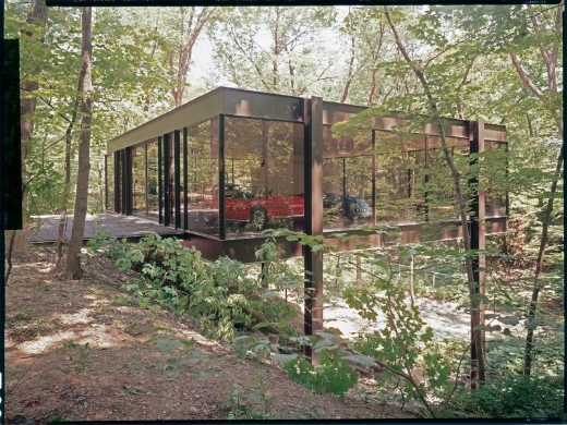
So you lot remember how retro-modern Cameron Frye’s house was, right? That fantastic metal-and-glass dwelling hidden in the woods? Well, apparently the fecker’s now for sale.


Ohh yeeaaahh

The Ben Rose Home-site of the famous movie ‘Ferris Bueller’s Day Off’, cantilevered over the ravine, these two steel and glass buildings, which can never be duplicated, have incredible vistas of the surrounding woods. This is a unique property designed by A. James Speyer and David Haid, both notable architects of the 20th Century. Estate Sale Sold ‘As Is’ No disclosures! This is an amazing architectural treasure.


Looks like they replaced the glass on that one side, since that accident with the Ferrari

Owned by a former photographer — the aforementioned Ben Rose — and located in Highland park, Illinois, this house was designed in 1958, and features four bedrooms, four bathrooms, and a three-car garage. Not only that, it’s got a hell of a view overlooking a ravine (obviously), and SWEET SLOW-ROASTED CHRIST IT’S CAMERON’S HOUSE.
With the price that they’re letting it go for, you’d think it was an authentic Hollywood prop, as they’re asking $2,300,000 USD for it. Does that at least include a Red Wings jersey?

I am buying that house, a Ferrari, and oppressively raising a kid who will ultimately destroy it all. Best cos-play ever!

– pwmolloy, gadabout and dude of all seasons

Okay, commence Ferris Bueller quotes… now

Random similar posts, for more timewasting:

This was the Future, Vol.17: supplemental on December 12th, 2009

This was the Future, Vol.35 on August 16th, 2007


This was the Future, Vol.37

typed for your pleasure on 5 May 2009, at 12.53 am

Sdtrk: ‘Three piece suit’ by Trinity

I have a friend named Jeff Lilly, aka Wolfgang — he used to live in Michigan but is now a schoolteacher in Japan — and he and I would get into friendly debates now and again as to the use or abuse of concrete in architecture, as well as the whole Bauhaus ethic of austerity. I’d champion austerity, saying that the vision of how the future was supposed to look was quaint and cool, like in ‘Rollerball’ and ‘THX 1138’, and WG would respond that living in those kind of buildings would turn society into the kinds of people you’d see in ‘Rollerball’ and ‘THX 1138’.
He would utterly despise this building.

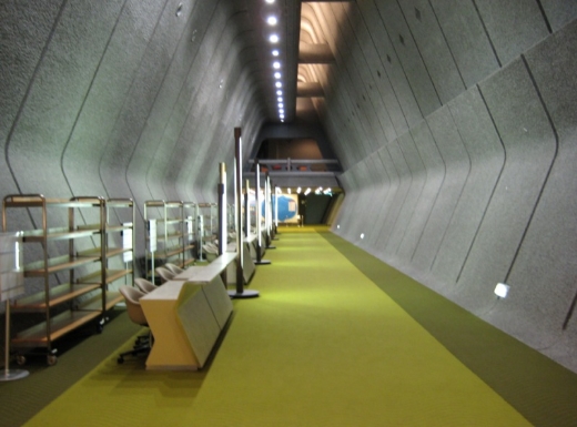
The Kyoto International Conference Center, or ICC Kyoto for short, was designed by Sachio Otani, and opened in 1966, which explains why it looks like it belongs in an episode of Ultraseven. And that’s pretty much all I can tell you about it. For one, it’s a conference hall, so the history isn’t tremendously interesting, and any information deeper than surface level is all in Japanese. In fact, through my Inter Net scourings, I’ve only been able to locate one photo of the interior that wasn’t like the huge conference hall, and it was taken by an ‘amateur’ photographer:


photo by Yoheis.net

Dig that hallway! Isn’t that fantastic??
Like I said, WG would punch this building if he could, but me, I love it. Looking at the outside from certain angles, the architecture suggests a Brutalist’s take on feudal Japanese castles, what with the projecting balconies and the use of criss-crossing lines. Perhaps that’s what Otani was aiming for when he designed it?
UPDATE (28 May): Just found a fantastic amount of fantastic photos of the place on Flickr, both interior and exterior, by Caspar B. Check them out!

Random similar posts, for more timewasting:

This was the Future, Vol.12 on June 3rd, 2005

This was the Future, Vol.29 on September 17th, 2006


This was the Future, Vol.36

typed for your pleasure on 17 April 2009, at 2.09 am

Yes yes, finally.
Sdtrk: ‘Ein neuer Tag’ by Daniela

So what took me so long to get back to this series? Err, laziness? Plus, it was getting to the point where I’d see an interesting house or building or designer I’d want to profile, and I’d bookmark it for later, and the selections really started piling up, and I’d be hamstrung by the sheer amount of choices. Well, I’m getting back into it, baby. Yeeaaahh. And besides, ‘Shouting etc etc’ isn’t a blog strictly about Synthetiks! It’s, err, just mostly about Synthetiks

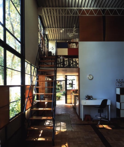
Tonight, we profile a structure so famous and ‘This was the Future’-worthy, that I’m slightly ashamed I’ve not already written about it. This would be Case Study House No.8, also known as the Eames House.

Charles and Ray proposed that the home they designed would be for a married couple who were basically apartment dwellers working in design and graphic arts, and who wanted a home that would make no demands for itself, but would, instead serve as a background for as Charles would say, “life in work” with nature as a “shock absorber.”

The first plan of their home, known as the Bridge House, was designed by Charles Eames and Eero Saarinen in 1945. Because it used off-the-shelf parts ordered from catalogues, and the war had caused a shortage in materials delivery, the steel did not arrive until late 1948. By then, Charles and Ray had “fallen in love with the meadow,” in Ray’s words, and felt that the site required a different solution. […]

Charles and Ray moved into the House on Christmas Eve, 1949, and lived here for the rest of their lives. The interior, its objects and its collections remain very much the way they were in Charles and Ray’s lifetimes. The house they created offered them a space where work, play, life, and nature co-existed.
taken from this site

Charles and Ray Eames: when they weren’t designing all manner of fab seating, or producing films such as ‘Powers of Ten‘, a short film that explores the scale of the Universe, they were busy with architecture. They weren’t just multitaskers, but design trendsetters in a post-WWII America. Prior to them, the word ‘modular’ wasn’t even in the popular vocabulary.

The exterior of the Eames House is available for visiting at practically any time; however, you have to be a member of the Eames Foundation to actually step inside for their annual tour. With a building that culturally significant and just plain cool, it might be worth the price

Random similar posts, for more timewasting:

This was the Future, Vol.18 on November 10th, 2005

This was the Future, Vol.06 on February 25th, 2005


This was the Future, Vol.35

typed for your pleasure on 16 August 2007, at 1.21 pm

Sdtrk: ‘Across the universe’ by Laibach

At times, I’m glad I’m not rich, as I am a bonafide sucker — perhaps one could even call me a sucka — for obscure and anachronistic technologies. ‘Technological white elephants,’ as Danielle Dax once called them. I used to own one of the infamous Fisher-Price PXL-2000 camcorders back when they debuted in the late Eighties — you know, the ones that record sound and image onto normal audiocassette tape — and since I sold mine, I start each day weeping softly into my pillow, regretting the tragic mistake that I’d made. Especially since working PXL-2000s run about $400 – $500 on eBay these days.
So you can imagine my Glee Meter (and my Esoterica Meter) going well into the red when I saw this online: VinylVideo.

VinylVideo™ is a fake archeology of media.
We designed a device that retrieves videosignals (moving image and sound) stored on a conventional Vinyl (LP) record. The discontinuity in the development of electronic film technology constitutes the historical background for this fictitious video disc technology: Even though television, the electronic transmission of moving images, had been feasible since the late 1920’s, storage of these images became possible only after development of the video recorder in 1958. Recording images for private use did not become available until the mass introduction of the VCR in the early 1980’s (!). Before, the average consumer was confined to use Super-8 film, a technology dating back to 1900, usually without sound. Recording of television was not possible at all.
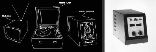
VinylVideo™ reconstructs a homemovie technology of the late 40’s/early 50’s and thus bridges a gap in the history of consumer technology. The images are stored on a conventional analog record, with a running time of ca. 8 min / side (Singles 4 min / side). These records are played on a standard turntable with an ordinary diamond needle, the signals are then processed by the VinylVideo Home Kit into a videosignal that is displayed on a black and white TV-set.
taken from the presskit

So it’s basically like the bastard child of Edison’s wax cylinders and SelectaVision, RCA’s well-meaning-but-doomed analogue storage format from the Eighties. Huh!

The site is fab, in and of itself; there’s a lengthy infomercial that explains, in a rather tongue-in-cheek fashion, what VinylVideo has over boring conventional television. Essentially, VinylVideo is a medium for video artists to make their art arguably more available to the public — it’s easier and cheaper to purchase a VinylVideo kit than it is to buy a work by Nam June Paik — and its super-lo-fi technology (they call the image’s quality trashpeg, tee hee) makes it easy to use and alter for one’s own purposes, if you’re into the whole deconstructionist thing. Personally, the biggest draw for someone like me is that it’s composed of sexy retro-tech!

You hook up your telly and home hi-fi turntable to this outsized converterboxthing, fiddle with a few knobs to fine-tune the image, and voila! Greyscale visuals flicker across your screen in a ghostly fashion, for as long as the record plays. The images that the conversion present seem like the perfect sort of medium for videos done by the growing crop of ‘eldritchtronica’ artists, such as those found on the Ghost box and Blank workshop labels — even the high-contrast pictures seem washed-out and murky. Lovely stuff…

It’s a shame I’m not rich, as the playback kit alone for VinylVideo goes for the horrifying amount of just over $3,400 USD. Kinda makes the highway robbery that extortionists want for a PXL-2000 seem quite reasonable and pleasant, eh?

Technorati tags: VinylVideo, Ghost box, Blank workshop, SelectaVision, Fisher-Price PXL-2000


This was the Future, Vol.34

typed for your pleasure on 27 July 2007, at 12.23 pm

Sdtrk: ‘Ceremony’ by Joy division

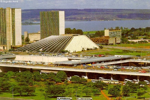
One of the reasons I prefer architecture — and by some extension, city planning — from the very late Fifties to the very early Seventies, is that there was still a sense of general optimism. Especially during the Sixties, when new technological innovations were popping up on a regular basis, man was setting foot on the Moon, and space travel was a new and fantastic thing. (Although there’ll be something to be said when space travel is no more unusual than taking a trip from one country to another.) It was this exact sort of well-meaning thinking that inspired the subject of this instalment: Brasília, the futuristic capital of Brazil, designed by the architects Oscar Niemeyer and the urban planner Lúcio Costa.


Teatro Nacional (National theatre) ‘Cláudio Santoro’
Photo © by Augusto Areal

In 1956, Juscelino Kubitschek de Oliveira is elected President and creates the Company of Urbanization of the New Capital (NOVACAP). Kubitschek invites a young architect, Oscar Niemeyer, to command the project. In the same year of 1956, the work on site starts. In 1957, a public contest is won by urbanist Lúcio Costa, who presented the inovative ideas for the design of the new capital, in his work which became known as Plano Piloto (Pilot Plan).

Juscelino Kubitschek, or JK, had the motto “fifty years in five”; his plan was to make Brazil grow during his five year term as much as the previous fifty years; JK invited car makers (like Ford, GM and Volkswagen) to come to Brazil, and opened several highways (in detriment of railways) to stimulate cars selling. However, JK’s darling was Brasília; to have the city finished still during his term, he didn’t hesitate in allocating financial and human resources into the works; several Boeings were rented to fly cement, sand and other supriments into the sites.
Juscelino was so obsessed with the idea of being founder of Brasília, that he officially opened the city on April 22 1960, before it was finished.
taken from this site

Considering that only five years before the city existed, it was a barren wasteland, that makes this urban accomplishment all the more impressive. Apart, of course, from the fact that all the main structures of the city, such as the Presidential Palace, the Federal Chamber, the residential sectors, the Supreme Federal Court, and the Brasília Cathedral, among many others, are all disparate, yet uniform. Kinda like the Bauhaus School, but filtered through 20th century Modern aesthetics… entirely lovely stuff.

The dichotomy of Brasília is that it’s classified by the United Nations agecy UNESCO with the status of Historical and Cultural Heritage of Humanity, due to its uniqueness. As I recall reading somewhere, this effectively means that the city is trapped in an architectural timecapsule — changing or updating the overall aesthetics of the city would be the equivalent of placing an enormous flat-screen monitor behind Lincoln’s head in the Lincoln Memorial. Some say that this handicaps the city’s ability to compete with the modernity of more contemporary cities across the globe, but I’m certain I echo many peoples’ sentiments when I say, ‘so what?’ Just because something is new or modern doesn’t necessarily mean that it’s good. Besides, we need cities like Brasília to show future architects and city planners how things can be more effectively managed.
But seriously, a citywide monument to Sixities architectural design? Fantastic

Random similar posts, for more timewasting:

This was the Future, Vol.36 on April 17th, 2009

This was the Future, Vol.22 on February 22nd, 2006


« Previous entries   Next entries »