This was the Future, Vol.27

typed for your pleasure on 14 August 2006, at 1.09 am

Sdtrk: ‘FRUiTS CLiPPER’ by Capsule

When I first saw this place, my mind immediately conjured up images from the film ‘Fantastic planet‘. I hated ‘Fantastic planet’. To be honest though, I’d like to see it again, but with subtitles instead of that hideous dubbing, as I think the dubbing was what really drove me away. Gods, that dubbing. But this building reminded me of ‘Fantastic planet’, and really, any sci-fi from out of Europe during the Sixties. This would be Palais Bulles (Bubble Palace), designed for fab fashion designer Pierre Cardin by Antti Lovag in 1970.
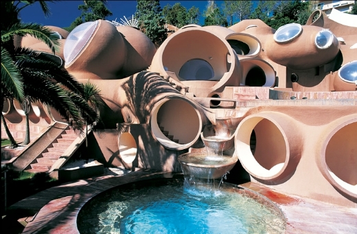
Lovag noticed that traditional habitations, like the cavern or the igloo, were round and reflected the way a human being moves in space. These houses were built “around” the human being and did not force him into rectangular spaces, like modern houses. Spheres and round surfaces reminded of the maternal uterus and avoiding any sharp edge they could prevent, according to Lovag’s theory, neurosis and violence. [..]

The interior is made of many round rooms, resembling foam bubbles, all furnished and decorated in a perfect ’70s style, no pictures on the walls, but big design lamps, coloured cushions and everywhere a deep, fluffy, wall-to-wall carpeting. Windows are big portholes with a round glass on them. The villa has also a conference room, a private cinema, a swimming pool and a tennis court.
quoted from this article

It’s occurred to me just now that this residence could be considered the spiritual sibling to Moshe Safdie’s Habitat 67 — it’s a closely-knit cluster of simple shapes, but instead of being cubes, they’re more globular. Also, it’s a single home, not an apartment structure. Also, it’s located in Côte d’Azur, not Montréal. Also, Palais Bulles is rust-coloured, not putty-coloured. I could go on.

Don’t know if it’s someplace I’d want to live — those concave walls would make it difficult to hang my trevor brown silkscreen — but.. o, who am I kidding. Like I wouldn’t move there, given half the chance (and all the money). Nice one, Antti!

Random similar posts, for more timewasting:

This was Glorious Future, Vol.15 on August 15th, 2005

This was the Future, Vol.43 on April 18th, 2010


This was a stupid idea

typed for your pleasure on 28 June 2006, at 4.57 pm

Sdtrk: ‘Thank your lucky stars’ by whitehouse

Normally I don’t do requests (unless, of course, there are delicious Synthetiks involved), but SafeT has been exhorting me to do a ‘This was the Future’ segment on the Millenium Dome. Well, you get what you pay for, mate.

pic taken from here, cos it’s funnier

The O2, formerly known as the Millennium Dome, is a large dome shaped building on the Greenwich peninsula in east London, the United Kingdom, at grid reference TQ391801. [..]

The dome was constructed in order to hold a major exhibition celebrating the beginning of the 3rd millenium. This exhibition opened to the public on January 1, 2000 and ran until December 31, 2000; however the project and exhibition was the subject of considerable political controversy and never quite achieved its objectives. [..]

The O2 is now normally closed. The failure of the project to match the hype became and remains a continuing embarrassment to the Labour government. It is still of interest to the press, the government’s difficulties in disposing of the Dome being the subject of much critical comment. The amount spent on maintaining the closed building has also been criticised. Some reports indicated the Dome was costing £1 million per month to maintain during 2001, but the government claimed these were exaggerations.
ta very much to Wikipedia

Also, it’s ugly. It looks as if someone placed a big white tarp onto the earth, draping it over those yellow towers, hoping the towers would support the tarp much like a big top, but the tarp was too heavy, and the towers ripped through. It resembles a.. errm.. huh. I don’t know what the fuck I’m looking at. It’s overly-vast, ill-designed, and ridiculous looking. Summation: dull, boring, corporate-designed ‘modern art’. Ugh.

Looking at the Dome makes me alternately sleepy, or angry. Which will it be today?

Random similar posts, for more timewasting:

This was the Future, Vol.38 on June 1st, 2009

This was the Future, Vol.14 on July 21st, 2005


This was the Future, Vol.26

typed for your pleasure on 27 June 2006, at 9.30 pm

Sdtrk: ‘It is narrow here’ by Eric Zann

For this action-packed installment of ‘This was the Future’, I’d been scouring various World’s Fairs-related sites for a decent candidate. The problem I run across with going through assorted World’s Fairs is that there are sometimes far too many fab-looking structures, and it’s simply impossible to choose just one. It’s bad enough attempting to select a single exposition to write on, let alone a single building in that selection, so you end up with entries such as the one I did for the Osaka World Expo 1970, for instance. I LOVE ALL MY CHILDREN EQUALLY!! HOW CAN I BE EXPECTED TO CHOOSE?? Sorry.

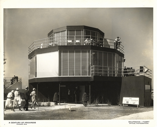
It looks like once again we’re going back further than the Sixties, and landing squarely in 1933, during the Chicago World’s Fair. One of its many exhibits had ‘Homes of Tomorrow’ as its theme, wherein various houses were assembled by various companies to sing the praises of whatever material they manufactured. There was a brick house (mighty mighty, just lettin’ it all hang out), a lumber house and a log house (for the love of god, no smoking please), a masonite house (non-Freemasons welcome), and an Armco-Ferro house (Lustron before Lustron existed). Which one caught my eye? The rather austere steel-and-glass number known as the House of Tomorrow, designed by George Fred Keck, of course.

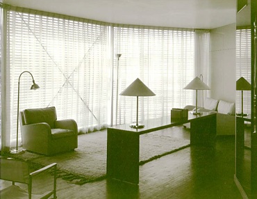
The standout even then was the House of Tomorrow, a three-story, 12-sided steel-and-glass structure designed by the early modernist George Fred Keck of Chicago. From the outside, the house resembled a glass-walled Bauhaus water tank. Inside, a spiral staircase wound around a central core containing utilities while a series of wedge-shaped rooms were furnished with tubular modern furniture.

A commemorative book issued at the time of the exposition says of the House of Tomorrow: ”Every modern convenience is made available at the touch of a finger. Absolute comfort is assured.”

Among the amenities were central air conditioning and a kitchen ”gas-powered to the nth degree” with a ”gas-fueled iceless refrigerator” as well as a ”mechanical dishwasher.”

The crowning touch, however, was ”an airplane hangar, which houses a small sized ship for family use,” attached to the back of the house.
quoted from this article

I honestly don’t know what impresses me more — the fact that the house has got a freakin’ airplane hangar, or that they used the term ‘the nth degree’. That’s a phrase that really needs to be reintegrated into popular speech, I think. ‘I’m enjoying this funnel cake to the nth degree,’ chirped Deirdre. ‘It’s really special.’ But I digress.
An airplane hangar! Back in the Future of the Past, the average American family was supposed to have their own personal light aircraft (undoubtedly in the Far-flung Future of 1970), hence the need for a hangar. Which would be really fab, but seeing as that we can barely trust people to be lucid enough when behind the wheel of a ground-based vehicle, perhaps that prediction was a wee bit over-optimistic..

The current fate of the House of Tomorrow is turning around. After the World’s Fair packed it in in 1934, it, along with the other homes of that particular exhibit, were placed on barges, and floated over Lake Michigan to their present location in Beverly Shores, Indiana. The plan at the time was to use the unusual homes to generate publicity for development of additional lakefront property along that area, but the plan fell through. For years, the houses were maintained by the Indiana park service, but as they weren’t really bona fide houses, so much as they were essentially model homes, they began to deteriorate, as they weren’t really meant to last. Thankfully, they’re now listed in the National Register of Historic Places, and the homes are currently being leased to private occupants who have agreed to restore them, in exchange for minimal or no rent. A happy ending!

The House of Tomorrow is no longer open to the public, but you can take a driving tour to see it, and take photographs from the front lawn until the owner chases you away with a broom

Random similar posts, for more timewasting:

This was the Future, Vol.32 on January 1st, 2007

Message in an (architectural) bottle on July 9th, 2007


This was the Future, Vol.25

typed for your pleasure on 19 May 2006, at 3.16 pm

Sdtrk: ‘Tourist trap’ by NON

Here we have another installment wherein we set the controls further back than the usual Sixties subjects, and fling ourselves headlong into early Thirties Paris. Let’s GO!
*grinding TARDIS noises*
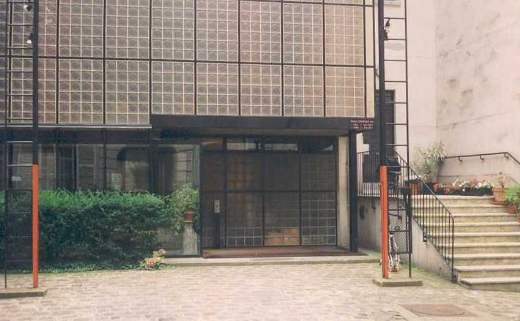
We’re here! Ahhh, Paris in the Spring! Smell those baguettes? No, I’m actually asking you if you can smell those baguettes — my sinuses are bollocked again and I can’t smell a damn thing. But look over there! What’s that fascinating steel-and-block-glass structure, in that courtyard off of rue Saint-Guillaume, you ask? Why, that would be the Maison de Verre (House of Glass), by interior designer Pierre Chareau and architect Bernard Bijvoët, naturellement.

Around 1927, a married couple with money and a good social position, Dr. and Mrs. Dalsace, were looking for a home in Paris. It had to be in the neighbourhood of the Saint Germain quarter which, as mentioned, was where Parisian high society of the time congregated. When they found the building at 31 rue Saint Guillaume, a big house on several stories between party walls in the central courtyard of the block, it was in such poor condition that both the future owners and the architect decided to demolish and rebuild it. However, an old lady who lived on the third floor refused to move, so they finally decided to demolish the two lower floors and keep what was above them. As well as being an unexpected setback, this meant that a technical feat was required to solve two simultaneous problems: on the one hand, constructing a new building underneath what remained without causing structural damage to the upper floors and on the other, bringing light to the interior of the new home, which suffered from a lack of natural light because of its narrowness and its position in the centre of the block.
quoted from this site

Maison de Verre (not to be confused with the equally fab, but not as glass-centric Maison de Verre in Brussels, Belgium) was also rather interesting in the fact that Dr Dalsace’s gynaecological office comprised the ground floor. How very Ballardian!

Innovations included ductwork that cleverly hid the electrical and phone wiring, sliding partitions that could be arranged for maximum use of space, a service lift and a private lift, and a series of hinged metal ventilation panels to allow breezes from outside to enter. It was a pretty unique building back then, and it’s still unique now. Vive la Maison de Verre! Liberté, égalité, fraternité! Cherchez la femme! I have no idea what the hell I’m saying!

Right, back into the TARDIS

Random similar posts, for more timewasting:

Dig my Future home of the Past in the Future on January 7th, 2005

This was the Future, Vol.39 on August 1st, 2009


This was the Future, Vol.24

typed for your pleasure on 15 April 2006, at 2.05 pm

Sdtrk: ‘I hate my generation’ by Sloan

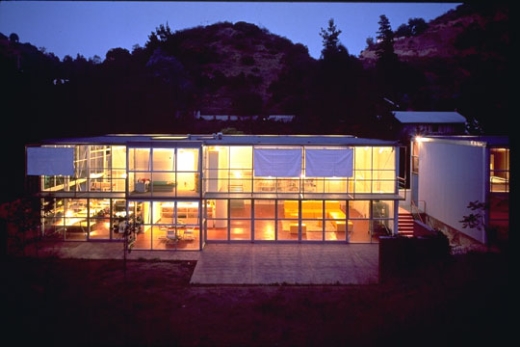
Normally, the concept of living in a place with another human being fills me with an almost palpable dread. However, I’d be willing to make an exception, if it meant we could live in the spaciousness that is the Willow Glen Houses, located in Los Angeles, California.

The project is for two single family dwellings for close friends who wish to live cooperatively rather than in more typical LA isolation. [..] While to two houses have the same structure and materials, the uniqueness of each families structure and interest is expressed in fundamentally different plan arrangements and different interior finishes such that each house has its own character internally.

Very nice! Reduce the costs of your house payments by living together, yet there’s enough separate space where you’re not living in each other’s pockets! But then, since it’s listed as ‘two single family houses’, I suppose each family would be making payments on their own house, as opposed to one payment for two living spaces that happen to be stacked on top of each other. Curse those deceptive builders, for making me think this was a money-saving venture! *shakes fist at builders*

Very fab structural design, though — gotta love open-plan. Although I’d be putting blinds everywhere, cos people don’t need to see what I’d be getting up to

Random similar posts, for more timewasting:

This was the Future, Vol.41 on October 5th, 2009

This was the Future, Vol.23 on March 18th, 2006


This was the Future, Vol.23

typed for your pleasure on 18 March 2006, at 11.47 am

Sdtrk: ‘Scheisse’ by the Seconds

We here at ‘Shouting etc etc’ — and when I say ‘we’, I mean, myself and Sidore-chan, and when I say ‘myself and Sidore-chan’, I mean ‘myself’, cos she won’t write for this bloody thing.
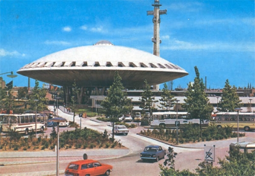
Where was I? O yeah. We here at ‘Shouting etc etc’ don’t really have any hard and fast rules for building selections for the critically-acclaimed ‘This was the Future’ series — basically, it should be from the mid-to-late Fiftes up to the mid-Seventies, or it should look like it’s from that time period, and it has to be interesting. Having said that, I’m not a big fan of saucer-shaped structures. With the exceptions of the Chemosphere and the Futuro House (review pending), I just don’t really like them, as I think they’re kinda forced and cliched. ‘IN TEH FUTURE, OUR HOMES WILL BE SHAPED IN THE STYLE OF THE SAUCERS THAT WE WILL USE TO TRAVEL TO THE STAAAAARRS!!1!’ I always thought using that particular shape for a building was a little dumb. Perhaps it’s the lack of corners that bothers me, I dunno. But recently I happened upon a structure I’d never heard of before: the Evoluon in Eindhoven, The Netherlands.

To celebrate the 75th birthday of the Philips company in Eindhoven in 1966, a special exhibit on science and technology was opened in the Evoluon, a futuristic building designed by L. Ch. Kalff. [..] The exhibition was designed by the British designer James Gardner. It was not a display of Philips products, but a museum with a message. Shown was how mechanisation and automating had increased production and made life more comfortable. You could see how modern society had its problems, from environmental pollution, depletion of natural resources to over population, but also how technology could offer solutions to these problems. Lots of science and its technical application could be seen.

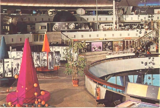
Yes yes, it’s an enormous saucer. But the interior.. my christ, the interior. That was the best thing about it! If you got Broadcast and Ghost box round to your office and hired them as interior designers, you’d end up with something a lot like the Evoluon. It was a science museum constructed in the Sixties, so naturally you had to have a lot of concrete hexagons, and chrome spheres, and perspex boxes, and metal ‘sound sculptures’ and things of that nature — it’s a rule. See if I’m wrong.

The museum also featured its own amateur radio station, a robot called the ‘Senster’ which reacted to sounds, an oversized Nixie clock that was used to display the number of visitors every day, and if you couldn’t get a guide to assist you, you merely requested a ‘Gidofoon’, which was a cassette deck that played a tape which explained each exhibit. Brilliant.

The exhibition was closed in 1989 due to the declining amount of visitors; however, the Evoluon still stands today, as it has been repurposed as a business-oriented conference centre. Good to see that the building’s still around, but without the Philips exhibit, it’s definitely not the same..

Finally, you have to view the videos, also hosted on Kees’ Evoluon Site (that’s the good one, not the corporate one). Even the music’s perfect!
So I guess the saucer-shape isn’t too inappropriate, as it’s transported me back to the Evoluon’s heyday. Rather clever, indeed

Random similar posts, for more timewasting:

This was the Future, Vol.21 on January 8th, 2006

Dig my Future home of the Past in the Future on January 7th, 2005


This was the Future, Vol.22

typed for your pleasure on 22 February 2006, at 11.22 pm

Finally, a new one!
Sdtrk: ‘Farfisa’ by Stereolab

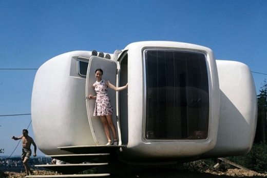
Upon your first casual glance at the picture below, you might exclaim ‘HAY! You’ve already done a feature on the Monsanto House, you filthy layabout!’ But alas, you’d be wrong. Wrong, wrong, wrong. While this structure is rather similar to Tomorrowland’s late-lamented House of the Future, this would be different. For one, it was designed by a French bloke by the name of Jean Maneval. Also, the Monsanto house was nowhere near Europe. So there. Nice try, though.
So this evening, we present the creation known as “Bulle“ à 6 coques, or the Six-shell Bubble House.

each living unit (6 shells) was easily transported by truck. the prefabricated shells were made of reinforced polyester insulated with polyurethane foam in three colour-versions: white, green and brown. the bubble blended ‘perfectly’ into the landscape.
quoted from this site

Aaand that’s almost the extent of what I’ve been able to ken (in English) about the “Bulle“ à 6 coques. Apart from that, the interior had its own special furniture line that fitted within the house’s shells, and production ceased in 1970, after only making 30 houses.

When first reading about the detail that the homes were moulded in three different colours in order to ‘blend in’ with the landscape, I chuckled heartily. Ha ha! Good Job, Mr Maneval! But after further reflection, I think the idea was rather fab. You have green for a home overlooking a lush, verdant hill; you’ve got brown, for the homeowner situated at the edge of a forest; and you have white, for those of you who live in predominantly snowy climes. (The white ones would probably be best used as chalets.) That’s Forward Thinking!
A large drawback though to the design is not so much the fact that there’s not a lot of privacy — unless you live by yourself, thereby making the “Bulle“ à 6 coques completely deserving of the title ‘Space-age Bachelor Pad’ — but they just don’t seem to offer a hell of a lot of room. Hrm.
O well. I suppose you’d just buy two of them and weld them together, then!

Random similar posts, for more timewasting:

This was the Future, Vol.16 on August 31st, 2005

A cruise, improved on August 17th, 2014


« Previous entries   Next entries »