This was the Future, Vol.21

typed for your pleasure on 8 January 2006, at 5.52 pm

Sdtrk: ‘No love to give’ by The United States of America

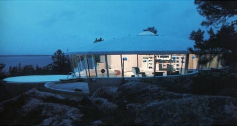
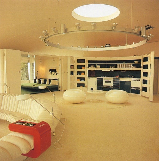
O, this entry’s a bizarre one. Not necessarily due to the building itself, which brings bold new meaning to the term ‘fab’, but of the odd circumstances surrounding it. Tonight, our spotlight swivels with a bit of a squeak, due to insuficient joint lubrication, and illuminates Villa Spies (pronounced ‘spees’, just so you know), designed by Staffan Berglund, and finished in 1969.
At the press of a button, Jetsons style, the central table and chairs rise into the ceiling, while a dining table rises up from the kitchen below. At the press of another button, slides can be projected onto the walls or the colour of the room can be changed via lighting control – an idea that has only recently reappeared in interior design.
quoted from this site

Lovely, lovely, lovely. HOWEVER! Finding info not in Swedish on Villa Spies (now known as Villa Fjolle) was a bit of a barney, as it was pretty much looked down upon by the architectural community upon completion, and the first monograph to actually discuss it and show it in detail was only just published in 1996. ‘Looked down upon?’, you ask, incredulous. ‘Why, wouldn’t this be the perfect place for sexy Moonbase operatives such as Lt. Gay Ellis to relax after her month-long shifts on the Moon, working with SHADO to defend Earth from alien attacks??’ That’s exactly what I said! Well, it appears that with the aforementioned design of the elevating diningroom column, it was implied that the homeowners would have servants preparing your meals downstairs, which, in an enlightened Sixties-era home in progressively thinking Sweden, was simply ‘not done’. Hrm…
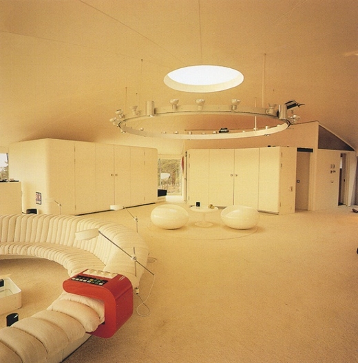
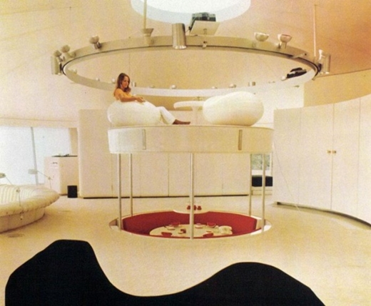
Were I an occupant of Villa Spies and inviting people round to dinner, I’d just make it down in the under-kitchen, set the readied plates on the table, and then have my guests enter. ‘Where the heck’s Davecat?’ they’d ask, approaching the centre of the livingroom. Then suddenly, I’d flip whatever switch, and ascend dramatically from the lower floor, smirking like a pro from behind the dinner table, as the meal would arrive. Preferably as the theme from ‘On Her Majesty’s Secret Service’ played over the speakers. ‘No, Mr Bond, I expect you to eat!’
Many thanks go out to Marc Berting, proprietor of ‘Seventies Design‘, which is where I first spotted Villa Spies. Ta very much for the info!

Random similar posts, for more timewasting:

This was the Future, Vol.31 on October 13th, 2006

This was the Future, Vol.16 on August 31st, 2005


This was the Future, Vol.20

typed for your pleasure on 22 December 2005, at 11.23 pm

Sdtrk: ‘Mile end’ by Pulp

On my inevitable headstone — a three-inch thick slab of moulded smoke-coloured perspex with chrome highlights, flanked by angelic figures carved in the likenesses of Twiggy and Peggy Moffitt — the inscription will read,


HERE LIETH DAVECAT
HE LOVED EXPOSITIONS FROM THE SIXTIES
MORE THAN ANY MAN HAS A RIGHT TO
ALAS, HE WAS BORNE TOO LATE
ALAS, ALAS

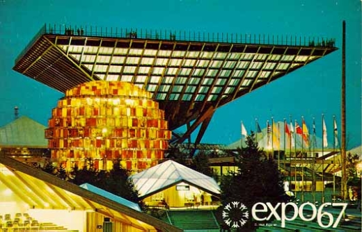
Well, probably not. But it is a statement based on fact, as evidenced by this latest instalment of ‘This was the Future’. Tonight! We peer intently at Expo 67, held in Montreal, Canada!


the Katimavik, Canadian Pavilion

Visitors could climb onto the gigantic Katimavik via a series of stairs including the final open one that cut diagonally up to the topmost perimeter of the inverted pyramid (an elevator for the elderly and handicapped). Inside a display of unusual “sculptures” was fixed to the four sloping sides. Many of them moved while eerie electronic music accompanied the sculpture’s movement in an odd dance of dance and movement. [..] The view of Expo from the Katimavik’s 109 foot high top was spectacular. Below, beside the Katimavik was the six story high abstract People Tree. Its brilliant red and orange nylon “maple leaves” were actually hundreds of color photographs depicting Canadians at work and leisure. At night they turned incandescent under floodlights.
taken from this site

It being an expo, the Katimavik wasn’t the only building with a fab design. The German Pavilion was a giant white-tent-with-metal-exoskeleton affair, Great Britain’s entry was an enormous white Brutalist slab, which somewhat echoed their castles and the idea of Albion, and the United states had a vast geodesic dome designed by the inimitable Buckminster Fuller. And, of course, some of the more astute fans of the ‘This was the Future’ series will remember that Expo 67 also was home to Moshe Safdie’s unique Habitat 67, appropriately enough.

I also think one of the reasons I dig Expos of the Sixties variety, is due to a lot of the overreaching Space-age names that the places and the buildings received. The Gyrotron! The Magnasphere! The Ultravex! The Panheligate! The Supertropophone! Fantastic, on so many levels

Random similar posts, for more timewasting:

This was the Future, Vol.13 on July 7th, 2005

Message in an (architectural) bottle on July 9th, 2007


This was the Future, Vol.19

typed for your pleasure on 30 November 2005, at 12.46 am

Sdtrk: ’22: The death of all the romance’ by the Dears

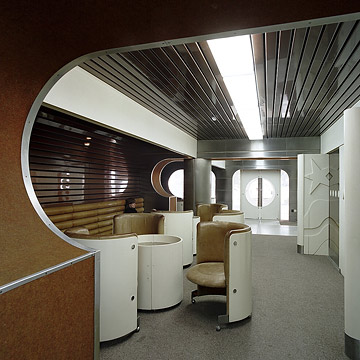
Good news, bad news: I’ve run across a site that contains not one, but 15 — fifteen! he said, squealing like a schoolgirl — sterling examples of 20th century Modern architecture from eastern Europe. The bad news would be that all the info contained therein is in Deutsche. Of course, if you naturally speak German, this is in no way a problem, but for me, it makes finding additional info difficult. Would you believe it’s nearly impossible to find anything on my personal favourite, the Empfangslounge für Regierungsmitglieder Flughafen Bratislava (Reception lounge for Cabinet members, Airport Bratislava) pictured below? Damnit!

Anyway, the site is called ‘ostmoderne‘, and if the above picture does nothing to stimulate your retro-modern aesthetic senses, you are dead inside. Dead, I say

Random similar posts, for more timewasting:

This was the Future, Vol.44 on September 29th, 2010

This was the Future, Vol.17: supplemental on December 12th, 2009


This was the Future, Vol.18

typed for your pleasure on 10 November 2005, at 4.46 am

Sdtrk: ‘Sorry for laughing’ by Josef K

Wee bit of a story behind the choice for this evening’s installment: A couple of years ago, I commissioned Mike, a mate of mine, to do an illustration of Sidore-chan for ‘Kitten with a Whip!’, and I wanted her drawn standing in a fab and distinctive setting. So Mike pointed me towards his vast library of reference material, and after poring through a couple of rather heavy books, I settled on a place in New York City, NY. I was really pleased with Mike’s ace rendition of both Sweetie and the background, and it was profiled as an omake (bonus) on ‘KWAW!’ for a couple of months. I’m sure some of you remember it.


Click here for full-sized version; opens in new window

For years afterward, the name of the actual location managed to elude me, until recently, when doing research for Vol.18 of the ‘This was the Future’ series. Now that I know what the place is called, I can finally sleep at night, thank god thank god.
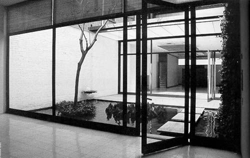
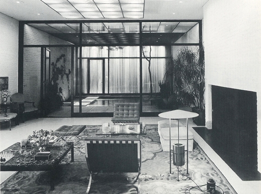
And so! We bring you the Rockefeller Guest House, by Philip Johnson.

The home is one room wide, and upon entering, the living room stretches far back until it is book-ended by floor to ceiling windows that closely mimic the façade’s layout. The living room space has white brick walls and features lighting fixtures designed by Mr. Johnson. Beyond the windows, there is a small courtyard that features a prime example of Philip Johnson’s concept of “safe danger”. In the courtyard, visitors must carefully walk on square travertine stepping-stones and avoid falling into the shallow reflecting pool on either side.

Oddly enough, there’s really not a lot of info on the Rockefeller Guest House; well, none that I could find. Sure, you’ll run across articles left and right on his Glass House, and I probably would’ve done an installment on the Glass House myself, but I’ve already done the Farnsworth House. (Zing!) But the Guest House is pretty ace as well. Granted, it might look like an uninspiring sort of miniature Fifties-built warehouse from the front, but the interior — especially that courtyard — is amazing. Subtle? Yes

Random similar posts, for more timewasting:

Tri-state and multinational on August 24th, 2011

for しどれーちゃん on July 18th, 2016


This was the Future, Vol.17

typed for your pleasure on 18 October 2005, at 11.44 am

Sdtrk: ‘What’s inside a girl?’ by the Cramps

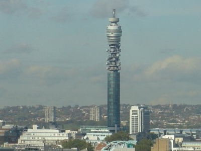
Tonight’s topic has been a familiar fixture of the London skyline for 40 years, and is an icon of London which is as iconic as London itself. (What??) Thanx to a couple of corporate buyouts, these days it’s known as the British Telecom Tower, but since I’m perennially stuck several decades in the past, we’re gonna refer to it by its original name, the Post Office Tower.

The Post Office Tower soars 250 feet above the dome of St. Paul’s and is the tallest building in Britain. It is 580 feet high and is surmounted by a 40 foot trellis mast supporting a radar aerial designed to help short range weather forecasting. [..]

Besides its strictly functional use the Tower adds to the itinerary of London’s attractions. The public can view the panorama of London from galleries near the top of the Tower. Two lifts, each travelling at 1,000 feet per minute, carry passengers to the three public observation platforms.

From its opening to the public in 1966, to 1971, the revolving upper section sported a popular restaurant called ‘topofthetower’. Could you imagine the view from there? Unfortunately, some tosser planted a bomb in the mens’ toilets in 1971, and since then, the tower has been closed to the public. But back during the Sixties, the Post Office Tower attracted hundreds of visitors, not only because of its views, but due to its unique and futuristic look. It was also prominently featured in the last half of the Lynn Redgrave/Rita Tushingham film ‘Smashing time‘ and was home to evil supercomputer WOTAN in the Hartnell-era Doctor Who story ‘The War machines‘. Where else would you store an evil supercomputer? That’s what I’m sayin’.

Tours are still available of the Post Office Tower BT Tower, but by appointment only. Certainly not the same as the days when you could playfully chase Rita Tushingham round and round within the glassy confines of topofthetower

Random similar posts, for more timewasting:

This was the Future, Vol.26 on June 27th, 2006

This was the Future, Vol.10 on April 17th, 2005


This was the Future, Vol.16

typed for your pleasure on 31 August 2005, at 11.43 pm

Sdtrk: ‘We build a golem for London’ by Mount Vernon astral temple

Okay, with this instalment, we’re back to the sort of architecture that genuinely makes me a wee bit sad to look at, cos I know I’ll probably never get a chance to live there, but at the same time, it makes me entirely giddy to know that a place such as this is still standing. This time, our focus turns to Habitat 67, designed by Moshe Safdie for the 1967 Expo in Montréal.

At the ground level, a service road system connects all service areas and parking facilities. One level above the service roads is a pedestrian plaza, and above that plastic-sheltered streets which connect all parts of the project through walk-ways and bridges. At no time is it necessary for a pedestrian to cross the service roads. To reach the homes on the upper levels there are three vertical cores, where the elevators serve the horizontal pedestrian streets.

Unlike most Expo exhibits, Habitat 67 remained after the exposition’s close, and remains fully occupied today. Mr Safdie was one of those architects that sought to change the way people lived in a social context, so he built a series of apartments that had the open space that most urban apartments were lacking. This place offered 158 units varying from one- to four-bedroom units, with open walkways that were sheltered from the weather by plexiglass walls. There’s a link at the bottom of the page I’d provided above, that recounts the experiences of a couple that moved to Habitat 67, that’s pretty interesting to read.

What initially hit me about Habitat 67 is that the whole place looks like it’s in motion (‘Nude Descending a Staircase’, anyone?), what with its cube-units going in and out at all sorts of angles and distances. The other appealing thing is due to its structural layout, everyone has their own back patio/mini-garden, which would be perfect for someone like myself, who doesn’t mind the outdoors and nature, just not in great amounts. Some amount of greenery, yet no yard to maintain? You’re speaking my language!

Habitat 67 is a Machine for Living, but with a personal touch. Once again proving that Expo sites feature some of the best buildings and structures

Random similar posts, for more timewasting:

This was the Future, Vol.10 on April 17th, 2005

This was the Future, Vol.17 on October 18th, 2005


This was Glorious Future, Vol.15

typed for your pleasure on 15 August 2005, at 1.21 pm

Sdtrk: something stirring and Communist

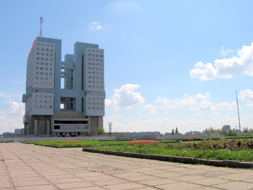
I’m sure you all recall that post I did months ago concerning the monstrous Ryugyong Hotel over in South Korea, right? Thanx to a tip from a mate of mine, I bring you the Soviet equivalent, aptly named ‘House of the Soviets‘. Going by the size of this place, the Soviets must be giants.

The House of the Soviets, begun in 1972, was never completed. The massive hulk now looms over the town like something out of a postapocalyptic movie, surrounded by decaying staircases and a plaza of four-foot high grass. Residents refer to it simply as “the Monster.” [..] At present there are no plans to do anything with it at all. “The authorities have decided it will be cheaper to let it decay on its own than to tear it down,” explained Olga Danilova, who shows tourists around. Only vagrants and drug addicts make use of the facility.
taken from this site

The story behind the House of the Soviets, or Dom Sovietov, isn’t exactly cheerful. During 1945, the German city Königsberg was awarded to the Soviet Union by the Allies. The USSR saw the city’s German heritage as a supposedly dangerous symbol of fascism, and they decided to pretty much level the town, and build a glorious new Socialist one called Kaliningrad in its place. In 1968, despite protests, one of the many buildings destroyed was Königsberg Castle, and in its place Dom Sovietov was erected, which was to be the central building of Kaliningrad.
Unfortunately, the construction teams really didn’t do their homework, as the 13th century Königsberg Castle had a network of tunnels beneath it. Consequently, Dom Sovietov is — you guessed it — structurally unsound, empty, and collapsing a little bit each day.

A lot of people have derided House of the Soviets due to its.. giant ugly brickness, but I think that’s why I like it. It reminds me a wee bit of Trellick Tower, and that whole heavy-handed pseudo-futuristic New Brutalism wave that quite a few designers were riding during the Sixties. But for Soviet Russia, it wasn’t New Brutalism, it was just plain ol’ Brutalism, cos Dom Sovietov is a fairly good example of how a lot of Soviet-era buildings look. I am Building, comrade, it says, I will stand firm against threat of Capitalist oppression. I am sturdy and thick, like good Communist woman. Or something.

On a positive note, archaeological teams are attempting to unearth and preserve what remains of Königsberg Castle. Hopefully Russia won’t make the same mistake twice, and they’ll choose to preserve House of the Soviets as well

Random similar posts, for more timewasting:

This was a stupid idea on June 28th, 2006

This was the Future, Vol.44 on September 29th, 2010


« Previous entries   Next entries »