This was the Future, Vol.14

typed for your pleasure on 21 July 2005, at 5.50 pm

Sdtrk: ‘There’s nothing’ by the Shout out louds

For this volume, this chapter, this segment, this episode, this instalment, of ‘This was the Future’, we go back further than the usual subjects from the Sixties, all the way to cover a building constructed in the late Thirties. This would be the Johnson Wax headquarters, which still stands in Racine, Wisconsin, and was designed by a then-69-year-old architect known as Frank Lloyd Wright.
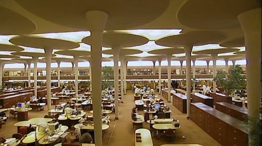
The columned ‘great workroom’ is one of Wright’s most astonishing spaces, surrounded by the light bands in the brick enclosing walls and opened by a series of tubular glass skylights that fill in between the curved tops of the column petals (columns); as Wright said, ‘the effect is that of being among the pine trees, breathing fresh air and sunlight.

Apparently Wright, zany madman that he was, also designed the desks that you can kinda see in the pic above of the Great Workroom, and those are still in use today as well. Even the attached car park sports a similar mushroom-topped design. When you’ve got a theme that works, I say run with it..

Little aside here, if you’ll bear with me: regular readers of this site know that I’m fanatical about my Sixties architecture, and it could be technically argued that highlighting a F.L Wright building is incongruous with previous volumes, and I would partially agree. But one of the main reasons that I like the Johnson Wax building is because it resembles something from the Sixties, which is actually when I thought it was constructed when I first saw pictures of it. Plus, my view on Wright is a wee bit unconventional — I don’t want to say he’s overrated, as I really do like his work (e.g, the Turkel house, the Ennis-Brown house, Fallingwater), but there are many other ace architects out there that don’t get nearly half as much attention as he does. Besides, my structural preferences tend to lean towards grey concrete, glass and steel, anyway..

Join us next time, where representatives from the Frank Lloyd Wright Estate kidnap me, and have me publically flensed

Random similar posts, for more timewasting:

This was the Future, Vol.11 on May 27th, 2005

This was the Future, Vol.17: supplemental on December 12th, 2009


This was the Future, Vol.13

typed for your pleasure on 7 July 2005, at 4.48 am

Sdtrk: ‘Strange design’ by Midnight movies

I think my usual statement of ‘I’ve seen this house/structure before several times, yet never knew what it was called’ really applies to the subject of Vol.13. I can recall only seeing these digs literally three times in my life: once, when viewing ‘Diamonds are forever’, another time after that, and the third time, during an episode of The Simpsons. When deliberating on what new structure to touch upon with this latest volume, for some reason this structure sprang to mind, and I’ll tell ya, it took me a couple of sweaty minutes looking the bastard up on Google, as I hadn’t Clue One as to what the place was called, or who designed it, for that matter…
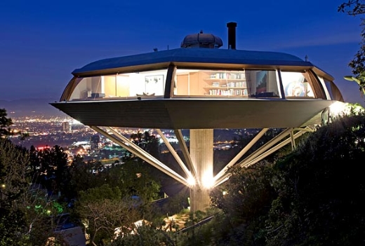
Tonight! Or Today, depending on when you read this! We will be spotlighting none other than Troy McClure’s house! (Also known as John Lautner’s Chemosphere House.)

Chemosphere is bisected by a central, exposed brick wall with a fireplace, abutted by subdued seating, in the middle. One side of the house is public, with a small kitchen and blended living and dining rooms including built-in couches below glass windows. The house’s private half includes a master bedroom with bathroom, small storage and laundry rooms, an office made of two children’s bedrooms, and an additional bathroom. Despite being more compact than many new single-family houses, it has most of the essential elements.
quoted from this article

What’s nice to know is that after years of neglect and disrepair, Benedikt Taschen, head of the famous Taschen publishing company, bought it, and has been living there since 1997. Good on you, sir!

Despite the fact that this home was built in 1960, it has an inexplicable late Seventies/early Eighties feeling to it. A lot of Modernist homes constructed round this time were naturally looking towards the future, but this one seemed ahead of its time, even in respect to its contemporaries.
Between aesthetic design from the Sixties and aesthetic design from the Eighties, I’d go with the former hands down, but the Chemosphere is still a unique winner

Random similar posts, for more timewasting:

This was the Future, Vol.43 on April 18th, 2010

This was the Future, Vol.34 on July 27th, 2007


This was the Future, Vol.12

typed for your pleasure on 3 June 2005, at 4.49 pm

Sdtrk: ‘The drowning man’ by the Cure

Another ABS-moulded spotlight on another ace designer; this time it’s Italian-born Joe Colombo.


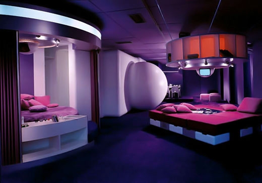
his ‘Habitat of the Future’ for Visiona 69

Joe Colombo’s future was an anti-nostalgic future (he would not have recognised as “future” the ‘90s in which we live today), in which an intelligent technology would have helped every human activity, laying the foundations for completely new living models. At the time, Joe Colombo designed entire living cells.
quoted from this site

He’s one of my favourites, as he was all about the Modular Living. With regards to his design for appliances, furniture, and living areas, he constructed spaces and things that could be well used and conveniently stored. Where’s the saucepan? Where’s the crockery? Ahhh, it’s all nestled within each other in the Mini-kitchen’s crockery drawer. A Colombo design meant that it promoted more efficient living, yet it was fun at the same time. This is a man who engineered a small glass that could be held with your thumb, while you hang onto your cigarette with the fingers of that same hand. (He loved smoking.) That’s called Getting More Use Out Of A Single Hand!

And no, I’ve no idea what that giant white sphere in the picture is for exactly. In all the articles in print or online that I’ve read that cover the Visiona 69 environment, not a single one indicates what that sphere’s for. Perhaps it contains pure, unfiltered Sixties! I dunno

Random similar posts, for more timewasting:

This was the Future, Vol.06 on February 25th, 2005

This was the Future, Vol.39 on August 1st, 2009


This was the Future, Vol.11

typed for your pleasure on 27 May 2005, at 3.38 pm

Sdtrk: ‘The event horizon’ by Air Miami

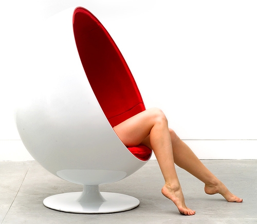
Right, I can’t believe I’ve not mentioned Eero Aarnio up until this point. Even if you’re not entirely familiar with 20th Century Modern architechture and design, everyone has seen his most famous work at some point or other, such as the Ball chair pictured below.

Aarnio was – and still is – one of the pioneers in using plastic in industrial design. Plastic material set the designers free to create every shape and use every color they wanted. This gave birth to objects oscillating between function and fun – but always fascinating ones. [..] Sitting in [the ball chair] is a special experience, because all surrounding sounds are softed down, and it gives a certain feeling of privacy. Aarnio himself has a ball chair with a telephone in it, and some people had it fitted with speakers.

The very first time I recall seeing one of the fantastic ball chairs was during the mid-Eighties. I was watching this strange-yet-engrossing show on our local Canadian telly station called ‘The Prisoner‘, and apart from the notable fact that No.2’s office/control room was swanky in that austere, Bond-supervillain kind of way, you’d usually see No.2 seated in a ball chair in the centre of the room. Very ace.
Years later, a retro furniture store opened up in nearby Ferndale, and they had the most beautiful and well-preserved ball chair in their window — white exterior, black interior, a matching footstool, plus built-in speakers with a line-in jack for your hi-fi. O yeah. After enquiring as to how much it was, I was told it was $800. Needless to say, I blanched at the time, but upon reflection, for a chair of that calibre, that’s actually a semi-reasonable price.

The chair’s long gone now, of course. Alas!

Random similar posts, for more timewasting:

This was the Future, Vol.30 on September 30th, 2006

This was the Future, Vol.12 on June 3rd, 2005


Behind the scenes of ‘This was the Future’

typed for your pleasure on 11 May 2005, at 1.26 pm

Sdtrk: ‘Super shooter’ by RIP SLYME

Many people of all walks of life ask me all sorts of questions*, but the one question I get most often is ‘How do you come up with the installments for your acclaimed “This was the Future” series?’** Well, I’ll tell ya. I have this really ace book perched on my shelf that was given to me by a friend, called ‘Twentieth-century Architecture‘. I’ll just flip through the bastard (at 400 pages, it’s a feckin’ doorstop) and settle on a structure — one that not only catches my eye, but one I think people should know about. Then I hop on the Internets and scour various sites for adequate sites describing my chosen topic, as well as a decent picture. If necessary, I look for a second site that has a passage I can quote on ‘Shouting etc etc’.
The process is rather the same if I cover something that isn’t a building in the volume, only there’s no one particular book I have for reference points. I’ll skim through my copies of ‘Op to Pop‘ or ‘Sixties design‘, looking for the name of a designer that I dig. Repeat the scouring/photo-saving/site checking process, and roughly fifty minutes later, I’m done!

So there you are! Vol.11 of ‘This was the Future’ due soon. Well, soon enough

*not all at once
**lies, scurrilous and unbridled

Random similar posts, for more timewasting:

Double not-so-angry on April 14th, 2005

A comment caveat / Well, dental hygiene is pretty important on March 20th, 2008


This was the Future, Vol.10

typed for your pleasure on 17 April 2005, at 10.15 pm

Sdtrk: ‘Steven Smith’ by the Organ

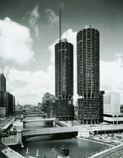
Here’s another example of one of those buildings that I’ve seen hundreds of times before, but I never really knew much about it: Marina City, located in Chicago.

Architect Bertrand Goldberg designed Marina City to be a “city within a city”. The apartment portion of the complex was completed in 1964. The two towers contained 896 units and a variety of amenities. [..] Amenities include the Marina Cleaners, Marina Food & Liquor, Crunch Fitness, 10 Pin Bowling, Bank One and several restaurants.

For my money, this is the way we should be living — cities that grow up as opposed to out. It’s pretty much self-contained! Any structure that contains living amenities as well as parking and shopping AND a bowling alley is beyond ace. Also, from what I understand, there’s a House of Blues in one of the towers.. which I find repellent, but apparently it used to be a theatre. Niiice.
Not only that, but the buildings themselves scream ‘retro Jetson-style living’, from their cylinders of concrete and steel, to the 19 lower floors used for car park purposes. But that’s to be expected from an architect that studied under my man Mies van der Rohe.

Should I suddenly decide to move to Chi-town instead, you’ll find me at those towers

Random similar posts, for more timewasting:

This was the Future, Vol.23 on March 18th, 2006

This was the Future, Vol.14 on July 21st, 2005


This was the Future, Vol.09

typed for your pleasure on 4 April 2005, at 12.39 pm

Sdtrk: ‘There is nothing I can do’ by The Organ

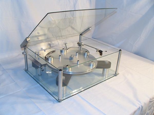
Right, hands up those of you who coveted, whether openly or in secret, Malcolm McDowell’s gorgeous transparent-and-chrome turntable from ‘A clockwork orange’. Apparently they’ve always been available, as they’re manufactured by a company called Transcriptors Limited (love that name). How come no-one told me?


the Transcriptor Vestigial

[Engineer and designer David Gammon]’s design concept was inspired by old clocks and watches from the 17th and 18th century. David had often asked this question many times over, why put something of engineering elegance into a black case or even worst, into a wooden case, that looked as if it had been made down in somebody’s garden shed. In fact Transcriptors started the trend to expose all the components so that they could be viewed from all angles.

Pretty horrorshow, I’d say. Just do yourself a favour — don’t look at the price

Random similar posts, for more timewasting:

This was the Future, Vol.11 on May 27th, 2005

This was the Future, Vol.40 on September 17th, 2009


« Previous entries   Next entries »