This was the Future, Vol.08

typed for your pleasure on 29 March 2005, at 1.57 pm

Sdtrk: ‘Give your love to be free’ by the Manson Family

One of the many reasons I want to move to Toronto is cos as it stands, I’m 32 years old, and I’m fecking sick of having to drive everywhere. Since Detroit might lose its reputation as ‘the Motor City’ if it actually had a working mass transportation system, there are very few functional buses, and no subway to speak of. In Toronto, on the other hand, not only do they have buses, but they’ve got these things called streetcars and like this train that rides beneath the earth, like some sort of subterranean way.. a sub-way! On the many occasions that I’ve been to T.O (as the hipsters call Toronto), I was continually impressed with the cleanliness and efficiency of their subway lines. Not only that, but the architecture of the subway stations themselves have always caught my eye.

In today’s installment, we cover the subway stations of Montreal! Cos I couldn’t find a proper website that highlighted the ones in Toronto.
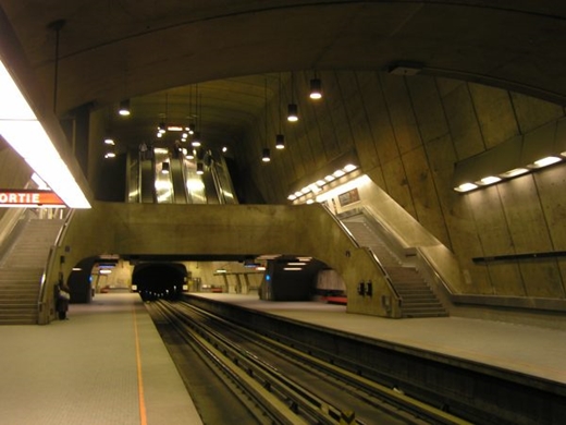
[The Radisson station pictured above] is characterized by dramatic rounded shapes in pale concrete and stainless steel, giving an impression somewhere between “metro train” and “starship.”

Since the site covers all of the stations in Montreal, you have to click on an individual picture to learn more about a particular station. My favourites have to be Beaubien and Radisson, and I’m sure you’ll quickly be able to divine why…
I highly suspect that once I move North, I’ll probably spend a month just riding the TTC lines, up and down, back and forth, getting off getting on, looking up looking forward. Should be fun

Random similar posts, for more timewasting:

This was the Future, Vol.25 on May 19th, 2006

This was the Future, Vol.18 on November 10th, 2005


This was the Future, Vol.07

typed for your pleasure on 19 March 2005, at 5.25 pm

Sdtrk: ‘Stairway to promotion’ by The Gerogerigegege

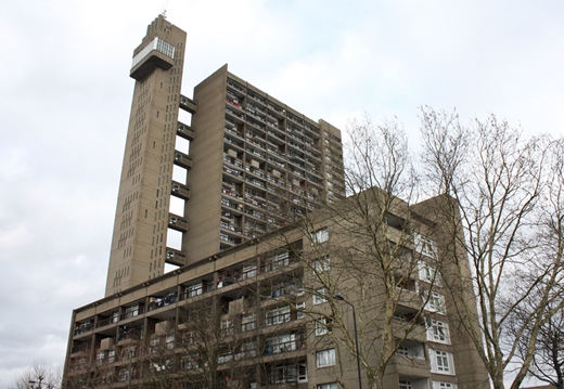
Pack yr architecturally romantic mind, as today, we cover the Trellick tower in west London, England, designed by Ernö Goldfinger. *cue Shirley Bassey*

In true Modernist fashion, Goldfinger’s Tower paid little heed to its surroundings- it dwarves nearby buildings, and its Brutalist concrete exterior makes it even more striking. It is a building which also paid little attention to the worries about Modernist housing in the late 1960s.

Trellick tower is a fine and standard example of the Brutalist style that took up a good part of Sixties architectural design. They were assembled in a style that ‘remained true to the material’, which resulted in buildings that were so lacking in grace that their monolithic ‘ugliness’ became beautiful in and of itself. (What can I say? I dig tower blocks..)

And as the story goes, Bond author Ian Fleming despised both Ernö and his aesthetic sense so much, that he took Goldfinger’s surname for his own villainous creation. That’s fame, baby!
‘No, Mr Bond, I expect you to die!!’ *cue Shirley Bassey*

Random similar posts, for more timewasting:

This was the Future, Vol.38 on June 1st, 2009

A cruise, improved on August 17th, 2014


This was the Future, Vol.06

typed for your pleasure on 25 February 2005, at 6.07 am

Sdtrk: ‘Sweet hit sherbet’ by Masonna

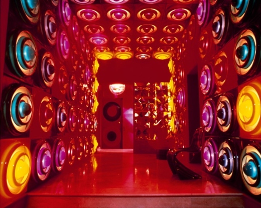
Instead of tackling architecture (sounds painful), this volume is about a really fab Danish designer by the name of Verner Panton. It’s still on topic!

Panton’s other great contribution to mid-century design is his ceaseless experimentation with lighting. His “Fun” series of shell lamps, his hanging “Globe” lamp and a wide variety of chandeliers introduced a new approach to lighting. He designed entire walls filled with lit panels and futuristic UFO shaped hanging lights. Panton’s designs were made to sway, spiral, create sounds and, most of all, to use color to create completely unique lighting systems for interiors.
quoted from this site

Verner’s designs exemplified a lot of the Euro-design from the mid-to-late Sixties. Back then, even if you didn’t know his name, more than likely you’d have seen one of his lamps, or sat in one of his chairs, or been lucky enough to wander around in one of his environments. You could argue that his style is ‘dated’ today, but that makes it all the better. These days, you’d be hard-pressed to find any contemporary styles that even come close to his uniqueness, and that’s what makes Verner’s futuristic Pop-art visions even more worthy of investigation

Random similar posts, for more timewasting:

A cruise, improved on August 17th, 2014

Behind the scenes of 'This was the Future' on May 11th, 2005


This was the Future, Vol.05

typed for your pleasure on 16 February 2005, at 2.11 pm

Holy crap, another one? Already? So soon? Yeah, why not.
Sdtrk: ‘Ushiwaka kurama iri’ by Merzbow

Europe, you need to send some of your cooler architecture over here. Or at the very least, some of your cooler architects…

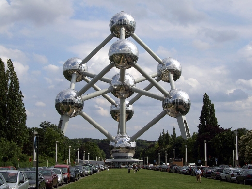
I’m sure a lot of you have seen this building before, and never knew what it was called. I just learned its name recently, cos I remember seeing it years ago, on the inner sleeve/lyric sheet of the ‘Sparks in outer space’ 12″ vinyl. This would be the Atomium, in Brussels.

Designed by the engineer André Waterkeyn for the International Exhibition of Brussels, that took place here in 1958, the Atomium is a structure that is half way between sculpture and architecture, symbolising a crystal molecule of metal by the scale of its atoms, magnified 165 billion times. [..]

The Atomium was not intended to survive the Exhibition of 1958. Its popularity and success, however, ensured its place as a major landmark on the Brussels skyline.

If that doesn’t scream ‘ATOM AGE FIFTIES FUTURE’, I don’t know what does. It’s a bit too wonky to be practical, but who says all buildings have to be practical?
Thankfully, not only did the Belgian government not tear it down after its initial usage was complete (yes, it was an exposition building), but they’re currently renovating it. Gooooo Belgium!

Random similar posts, for more timewasting:

This was the Future, Vol.06 on February 25th, 2005

This was the Future, Vol.22 on February 22nd, 2006


This was the Future, Vol.04

typed for your pleasure on 15 February 2005, at 8.48 pm

Sdtrk: ‘Choking on air’ by the Ladybug Transistor

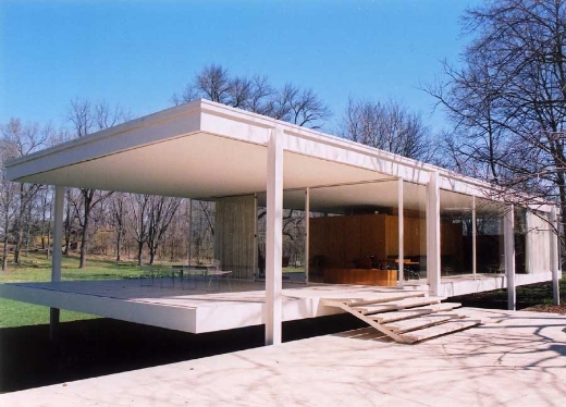
This selection is something I don’t know if I’d want to live in, but I’d definitely love to see it. Tonight, we look at The Farnsworth House.

The one-room, steel-and-glass house designed by Ludwig Mies van der Rohe that has been called one of the most important works of 20th century architecture. Located in a beautiful meadow on the banks of the Fox River two miles south of Plano, the Farnsworth House has been called “sculptural” in its simplicity and a masterpiece of design. Mies’ temple-like pavilion both invites and challenges visitors.

This would be one of those places that I’d seen a few times before in print, or some other media, but I never really paid genuine attention until I saw it on the front cover of The Aluminum group‘s ‘Plano’ Cd. Their choice of the Farnsworth House fit the music perfectly; very smooth, seamless, polished, light and airy. It’s the exact sort of building you’d expect from a man who worked as the director of the Bauhaus school in Dessau. (ooh, the Bauhaus.. I’ll have to cover that soon..)

It’s a beautiful home, but I couldn’t picture myself living there. You wake up in the morning, sluggishly making your way from the bedroom to the kitchen in your PJ bottoms, and you notice several woodland creatures observing you from the other side of the glass. A couple of bears have set up lawn chairs a few feet away, from which they sit comfortably, watching you as you nervously try to make your eggs benedict. A group of rabbits titter when you accidentally pour maple syrup onto your slippers for the second time. Who can live with that sort of scrutiny day after day??

Tours are available! Wear clean socks or stockings though, as I understand you have to take your shoes off before entering

Random similar posts, for more timewasting:

This was the Future, Vol.20 on December 22nd, 2005

This was the Future, Vol.25 on May 19th, 2006


This was the Future, Vol.03

typed for your pleasure on 2 February 2005, at 12.57 am

Sdtrk: ‘The click and the fizz’ by the High Llamas

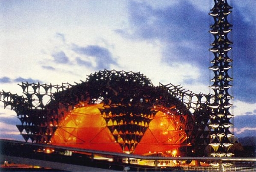
This post was going to be about another one of those crazy examples of Sixties architecture that make my pants a couple of sizes too small, and I managed to stumble across a site dealing with The Osaka World Expo 1970, where I was basically overwhelmed by too many examples of fab architecture. So, rather than attempt to pick one, I’ll just provide the link here.


the Toshiba IHI Pavilion

The unique building was designed to convey a poetic image on the theme “hope” giving the future the look of a forest.A 55 meter-tall symbol tower made of the same tetra-units was erected in front of the Pavilion. [..]

The Global Vision Theater seemed to tee breathing, with 369 lamps fixed to the tetra-units. The lighting display was repeated at intervals of 20 minutes.
taken from this site

Pretty much all of them are remarkable, but the ones sponsored by Japanese corporations are my favourites. You get all these lysergic structures that look like they belong on the set of Ultraman. Fecking wonderful.
This is what I’d be doing if I had a TARDIS — visiting all of the old World’s Fair Expositions. Yep, visiting expos, and hitting on Edie Sedgwick

(EDIT: since I just decided on the above title being a cohesive name for this topic series, if you somehow missed the other two, they’re right here)

Random similar posts, for more timewasting:

This was the Future, Vol.30 on September 30th, 2006

This was the Future, Vol.08 on March 29th, 2005


mein letzter Freitag / Another Space-age Bachelor Pad

typed for your pleasure on 20 January 2005, at 3.13 am

This Friday past, I finally watched the last two episodes of Zeta Gundam. Damn, that show is fucking fantastic and grim, all at the same time. It’s beautiful.
Now, I’m the kind of bloke who has been happier with the anime industry standard that was more or less established during the mid-90s, where television series lasted for twenty-six episodes, as opposed to fifty-two, in order to drive the story along better due to there being less ‘filler’ episodes. (Also, I gather a largely significant reason for the shorter runs was due to a lot of studios not being able to afford long, drawn-out shows.) Zeta was made back in 1986, before the shorter series trend kicked in, and therefore runs 50 episodes. My worry with the series was that there were going to be a lot of throwaway epiodes that could’ve easily been omitted. I can think of maybe two off the top of my head; the rest of the series jets along at a rapid and suspenseful rate — ‘mostly killer, little filler’ if you will. And, as I’d known all these years between perusing the episode guides in Animag and actually watching the series a decade later, that yes, the ending of Zeta Gundam is even more messed up than I knew it to be. The Stark Fist of Tomino spares no-one.
Now, if you’re curious about seeing the series, but aren’t a rabid Zeta Gundam fanboy where you’d want to fork out $120+ for the box set, you can just wait a couple of years, as Bandai/Sunrise studios are doing what they did with the original Gundam series, and condensing 50 episodes into three feature-length films, with the first one premiering in March..

Also, Shi-chan & I cranked out another photo shoot! Can we be stopped??

Well, apparently yes, it turns out we can be stopped. We wrapped it up after only 80 photos, cos with both the room radiator & the lights cooking us like an EZ-Bake Oven, it was far too hot to continue. (Plus, if Shi-chan learned to move herself, that would help tremendously…) We might pick up again with the same clothes at a later date, but I still need to get the pics from the previous shoot ready for posting. Deadlines? What the hell are those??

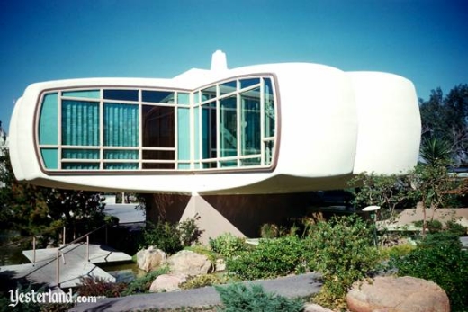
Aaand here’s another stylishly retro-futuristic home for your approval: the famous Monsanto House of the Future, featured in Disneyland’s Tomorrowland from 1957 to 1967.


pic shamelessly stolen from Yesterland

Welcome to Monsanto Plastics Home of the Future! As you entered this experimental model home, perhaps you noticed that the house itself is constructed entirely of plastics. Despite the graceful lightweight appearance of the suspended wings of this house, each one is able to support more than 13 tons!

The floors on which you are walking, the gently sloping walls around you, and even the ceilings are made of plastics. Furnishings and equipment, as well as the house itself, are almost one-hundred percent manmade. Hardly a natural material appears in anything like its original state anywhere in the building.

*vibrates with joy*
The only thing I can think of off the top of my head to improve this modern masterpiece, would be wall-to-wall carpeting, as I don’t really like bare floors. And, err, cable jacks in every room. Those are just off the top of my head. But yes! The fecking Monsanto House! I really regret that I never got the chance to see it, and I think they should rebuild it elsewhere, for posterity’s sake. I mean, something like that is as significant to architectural history as something built in the 1700s, or anything involving a Corinthian column. And if you ask me, since 20th century Modern architecture & design combines both Form and Function, it’s much more impressive

Random similar posts, for more timewasting:

Tip o' the iceberg! That's a traditional Irish greeting on May 23rd, 2017

Any Synthetiks-related news, Davecat? (May 2008) on May 3rd, 2008


« Previous entries   Next entries »